Before I approached this badge, I’ve honestly always thought that web names are paid to some government regulated domain hosting site and requires much more of a hassle. But now I can confidently say that selecting a domain name, web server, and uploading your own website is much easier than it really sounds (thanks to the technical language behind internet technologies).

When I first set out to find a server host and domain registrar, the three big criteria I used was simply price, plan flexibility, and credibility. Since I don’t have a clear idea about what I want to do for my personal website besides it being my personal portfolio site, I did not know how much I wanted to invest in a personal website yet. thus I was really looking for something that was low-risk, low-capacity, low-price, simple, and trusted by the web community. So I searched around for top lists of web hosts and found 1&1 via a Lifehacker top-10-list. But the biggest factor that reeled me in for the buy was their current pricing promotion, which was much more affordable than other web hosting websites. Also, 1&1 had monthly plans rather than yearly plans, which helped me see its sell proposition to fit my needs.

Me trying to figure out the 1&1 custom control panel, which is conveniently talked about in Lynda.com’s videos on managing hosted websites.

Overall, I was quite impressed with 1&1’s video tutorials about the control panel because I had completely no idea how to utilize it. But the one thing that bothered me was that it assumed you had some kind of  FTP client that would interface with the domain. Thankfully, I was able to stumble upon the idea to use Trinity’s wonderful Lynda.com resource. So I watched a few helpful videos from Ray Villalobos’ Managing a Hosted Website, which really helped me see every single step to get your html, css, javascript files into the root directory of the purchased domain.

And finally, I was able to get my FTP client FileZilla to access my server!

Now, on to converting the placeholder site into my personal portfolio site, http://www.fujonomous.com (PLEASE NOTE: I am currently still waiting for registration approval of this domain name, so will be hyperlinking s414517201.onlinehome.us temporarily…)!

Here is my site.

Definitely not the most difficult badge out there, but still pretty useful if you are thinking about gathering user information. Most of the form work wasn’t too bad since our last minisite dealt with that ALOT. Though I would love to learn more about using perl (the server language, among others) to further understand the “back-end” of the wired forms process, this badge did allow me to understand the basics behind wired forms.

So, if you all want to figure out what type of superhero you want to be, click here fill out my form! I will surely enjoy your input 🙂

See my paper here.

One of the futuristic technology niches that I have always been fascinated with is human augmentation. That is not to say that I would sign up for some replacement robot limbs at the moment, but that is what my forecasting paper is surveying. In particular, my paper centered around four main technologies that have various distinct levels of change flexibility: wearable technology, ingested technology, implant technology, and prosthetic technology.

Generally, I tried to utilize a wide array of resources, ranging from news articles covering a particular technology to academic articles about posthuman perspectives and examples while using other online publications on the particular technology I was looking at. The academic articles provided me ideas about the potential implications with which I formulated my forecast scenarios while the news articles and other online publications provided brief overviews of the technology.

Ingested Pills by Proteus Biomedical Inc., which functions to examine and observe vital signs and drug intake. It is also activated by stomach fluids.

After evaluating these technologies, the paper took a stab at forecasting the future and I ended up with several accelerated scenarios depicting each technology. The wearable technology will become more flexible, lighter, and more user friendly, utilizing nanotechnology to downsize the requirements a power suit needs today. So imagine a jacket with which you can augment your strength or agility by 125%. Sounds pretty awesome, right? (I know, I know. I’ll talk about the constraints of these scenarios later on) The ingested technology will, in the future, allow us to better control what we do with our bodies with more sophisticated metrics and sensor abilities. But don’t worry. These ingested “pill” technologies will be expelled after its programmed duration. I see implant technology becoming more permanent, where it becomes commonplace for certified adult professionals/specialists to augment their brain by adding a neurotransmitter that safely and mildly stimulates the proper parts of the brain to improve human thought process and productivity. For the prosthetic technology, I foresaw technology as a superior replacement to our bodies, where limbs are near indestructible (to common hazards) and surpass our current biological potential.

South African sprint runner, Oscar Pistorius, known as the “Blade Runner” and the first amputee to win an able-bodied world track medal.

But the main conclusion after forecasting these technologies is that humans need to be responsible for what they are inventing. Especially after reading Bill Joy’s The Future Doesn’t Need Us for this course, it is difficult not to see the impending doom of unrestricted and un-policed new technologies. Particularly, human augmentation deals with genetics, nanotechnology, and robotics and should be heavily regulated and governed with sufficient policies and laws.

Here’s my minisite 3!

WOW. That minisite actually took longer than I thought. Thankfully, I had plenty of coffee today to keep me going and I’ve finally created a working minisite that contains a parody version of Google’s (or Scroogle’s) Search Page , United Airlines MileagePlus Sign-up form, Newegg.com’s Homepage, a self-created anonymous page, and a personal analysis page.

I definitely am very glad that I didn’t hit too many frustrating roadblocks along the way (averaging around one every 45 minutes, which is stupendous!) . The main largest problem I had was just making websites that emulate the same feel and tone (since I knew I couldn’t possibly get everything perfect) of their parent sites. This included a number of things like CSS positioning, <div> tag positioning, and accessing the correct data that is stored in localStorage.  The one big thing that really saved me big-time was writing down all the names I defined for each stored data, id, and class on pieces of post-it notes so that I can quickly recall the designated for a particular element I wanted to access.

Keeping notes of my element names has helped me countless times when I was looking for a way to access them quickly. Definitely something that is useful when dealing with thirty-something different element names.

Of all the sites I created, I definitely was most proud of my Newegg.com parody–Oldham.com! Overall, this assignement really helped me get familiar with CSS, JS, and HTML while being able have loads of fun making up random parody content. Thank you, Dr. Delwiche!

By far, took me the longest to complete...but quite satisfying. The most difficult thing to do was really stylizing everything to look remotely similar to Newegg. I went ahead and used similar color schemes, similar logo styles, and layout structure.

Here’s, what I was going for…
🙂

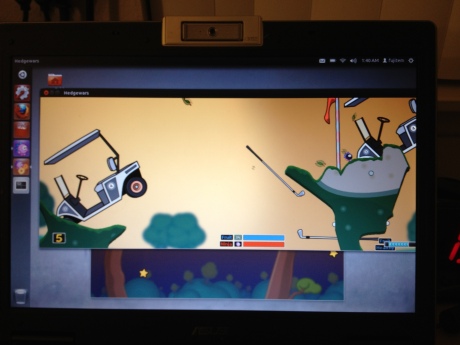
Playing Hodgewars on Linux, a game based on the original "Worms Armageddon" series

One has to wonder why linux never became as popular as the iOS or Windows OS (at least Ubuntu 11.10 should be because it’s unbelievably sleek).

It’s free. It’s community-supported. It’s legal. And it’s free. What more can you ask for as a college student?

I guess I just don’t quite understand how Microsoft still manages to convince their consumers that purchasing their proprietary operating system is more advantageous when something else is out there that’s FREE (I promise that’s the last time I’ll say that). Though I’m still trying to get a hang of the interface and the “less-snappy” menu bar (when you click on ), I’m just glad that this badge has finally introduced me to a  Linux operating system.

As much as I am enjoying the freshness of Ubuntu now, I did hit a few minor bumps before I was able to get it up and running (and by running I mean installing). Initially, I installed Ubuntu using the windows installer wubi and the installation, which went fine…until it began crashing my computer for some reason. The installation did finish. However, when I logged into Ubuntu, everything was terribly slower than my Windows 7 OS. So I thought something must be wrong with the way I installed it. So I looked up on the forums and someone suggested to just re-install it using a USB (and yes, I kind of got too excited when I started working for this badge that I completely forgot to read through the detail descriptions. But for those of you guys who do read this and are thinking of using the windows installer wubi, I would recommend to first read carefully through the badge description before letting your curiosity wander.  The following issue I had with the installation was that I wanted to wipe my Windows OS partition and use the entire hard drive space for Ubuntu. So I picked the third option when the installer window popped up. Afterwards, I deleted my Windows partition, but I never installed a Ubuntu manually through the partition window. So when I selected my entire hard drive thinking I just needed to press the install button below…A ERROR MESSAGE SHOWS UP.

So this was my other error besides not having a "swap partition," the "root" partition.

Ubuntu says that he/she needed a swap partition. A what?

Me figuring out the Ubuntu partitioning process...

So I went online trying to figure out what it is and according to this linux site, a swap partition functions essentially like dynamic memory (RAM), where you need to allocate some space for it to work. Luckily, Google was there to answer my “how to partition ubuntu 1.10” queries with this step-by-step site which told me that I needed a MINIMUM of TWO PARTITIONS. So I followed what the site suggested…adding 2GB partition for the swap partition, a 10GB partition for the “/” root partition, and the rest of it as my “/home” and personal use partition. But aside from that, the rest of the experience was just wonderful.

A curious cat video being streamed with Ubuntu

Logging on to Filezilla to transfer some class files with Ubuntu...

The Ubuntu OS interface is highly similar to the apple iOS (or the other way around since I somewhat recall Dr. Delwiche telling me in class that the iOS is based off of linux systems, correct me if I’m wrong). At least the version I got looks pretty similar to me. For example, aside from its UI designs, it has functions that are familiar to Mac users, such as the “Workspace Switcher.” Another thing I really enjoy about the Ubuntu is that it has one centralized Ubuntu Software Center (alike the iTunes App Store) that finds most of the updates you need. So overall, a highly user-friendly operating system that anyone can enjoy with a 6+ year old laptop that makes me a happy OS user.

I must say, the pen tool really wasn’t all that bad, albeit there were times when it was a bit difficult to pen-tool (it’s a verb) my way through small crevices and small awkward bumps that require precise control over my mouse. Initially, it was a bit challenging to understand the way the pen tool functions to create the desired “curves” for the desired selection, especially when my pen tool would make awkward loops and nothing I did could fix it. This was, of course, my preliminary attempt at the pen tool hoping I could summon my technical intuition and learn it in 20 minutes.

So after making some doodles with the pen tool, I watched a short video by Richard Harrington called  making selections with a pen tool, I tried out the pen tool for a while to understand the inner workings of the pen tool anchor points and control handles. For this kind of task, I felt that the tutorial videos are definitely more effective in describing the minute and/or complex movements required to draw effectively with a pen tool because (at least for me) the pen tool was not exactly the world’s most intuitive tool when you compare it to the paint bucket tool.

After the pen tool badge description was posted, I also watched Deke McClelland’s videos on Everything about The Pen Tool to see if I missed anything about the pen tool. I was, however, quite confused with McClelland’s  use of shape tools to create paths because I found the pen tool to be far superior in terms of tracing complex shapes. But I suppose it offers us a more diverse method to doing one thing (should an occasion arise that requires it).

Overall, I didn’t think there was really a “trick” to getting used to the pen tool. Most of it for me was just to practice on highly complicated outlines (e.g. landscape or foliage of some sort), which may all sound tedious and frustrating work, but it really does push you to figure out a way to forge a path or lining that can be highly useful in future graphic designs. And believe me, you will love the pen tool once you learn to utilize it.

The "after" of the silhouette. Chose white over black as the background is a bit dark.

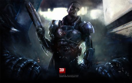
The original picture I started with--a highly complicated looking character from MasThe following are screenshots of my creative process for creating a magazine cover:

Before I entered the picture...

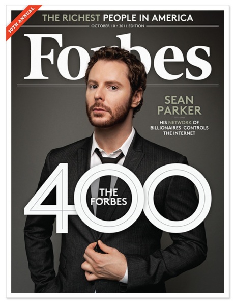
(After) "Want to be a billionaire..."

I’ve always been fascinated with minimalism and its ability to efficiently function and be gorgeous–if done correctly. That is what drove me to seek the Minimalist Design badge. For this badge, I have created two layout designs (one desktop wallpaper and another homepage screenshot) that exemplify minimalist design.

A desktop wallpaper design that consists of alot of white space in the top right corner and usage of simple "outline drawing" to simplify the message communicated.

Inspired by Apple's website, I used the "brushed steel" effect to provide a simple but elegant background to the homepage design which redirects viewer's attention to the center navigation of the site.

In both of my designs, I heavily thought about utilizing white space and how to best compose a design that was aesthetically appealing and helps viewers identify priority in terms of viewing the website. Thus in my wallpaper design, I made sure to draw a high-contrast but faded grid that allows the main doodle drawing to subtly “pop out” and provide an ample sense of white space composition. For my homepage design, I decided to use a stainless steel “brush” effect that conveys a more calm, elegant, and clean look. This design is heavily influenced by Apple’s website and its low use of colors other than shades of black, grey, and white, which allow for white space to be used widely around the navigation area of the website. On both of the backgrounds of the two designs, I also made sure to give them some depth and texture by adding inner shadows that help further shape the white space.

Secondly, my designs are also focused on honing Cameron Chapman’s advice to “use bold but few graphics for visual impact.” My wallpaper design does this by only having one large doodle drawing picture of a boy drawing a graph roller coaster. I purposefully decided not to add any other text inside the picture so that viewers will become curious and easily interpret the message themselves. I also added a short quote by Steve Jobs at the bottom right margin area that functions as an impactful anchor that provides meaning to the general picture. Instead of using one large simple picture to generate impact, the homepage design offers three generically drawn doors that also create curiosity for the viewer to click on the three doors to find out more about the person’s identity. In this, the usage of the door icons represent a kind of minimally accessible yet mysterious journey for the user to “get-to-know” the identity of the website and its architect and thus help draw viewers to explore it.

Going along with Chapman’s “use bold but few graphics for visual impact” advice, another alternative to using minimalism is the bare use of color. Of course colors do make things more vibrant and diverse, but they can also offer too much focus and potentially confuse the viewer. Hence, for my wallpaper, I used a relatively comfortable shade of brown for the background and used a slightly faded and thin stroke of white doodle picture to overlay the faded grids. My homepage used a white to dark gray gradient and little use of lime green for the website logo. I also made sure to keep the copy text on both designs consistent with their respective color palettes. For example, the light gray “Ah. You’ve found me. Welcome” message on the personal website helps integrate and contextualizes the door graphics. Therefore, the sparing use of colors helps the designs reinforce their message and really works as an essential piece to minimalist designs.

Karol K. claims that minimalist design is a fad, but I’m sure that it is here to stay… for a while longer. And besides, it truly does make designers put more thought into their work so that they are lean and effective.

My initial wireframe. This gave me the idea to use horizontal drop-down menu bars.

Fantastic! Everything is finally workingI have declared every CSS and HTML code to sign temporary treaties with each other and managed to end up with a website that is relatively neat and simple without looking terribly unfurnished (by my beginning CSS standards). But it definitely was a taxing assignment that offered some serious learning curve.

All in all, the largest hurdle for me by far was making a working horizontal navigation drop-down menu. My issue here is that I tried to adapt my code to a tutorial rather than start from scratch. Thus there were junctures in the tutorials where I thought I did everything theoretically correct (and triple-checked the code) but resulted with navigation bars that never displayed or rolled over properly.

This was the revised wireframe idea I came up with after reading my four articles on minimalist design. I also made some changes to the "centered look" of the layout because of the 960 pixel parameters this assignment required.

In the end, I succeeded with the help of a tutorial Dr. Delwiche pointed out to me, but I still couldn’t fully grasp the mystique behind addressing unordered lists, list items, and their nested layers. Other than that, I had some small hiccup problems with the box model and the floats of my paragraph columns, but that was quickly resolved after I remembered to create a div class and cleared the floats where I didn’t need them.

My website finally up and running with the successful navigation bar roll-over thanks to ":hover"

Thinking back now, I’m glad that I wasn’t able to get things right the first time because I wouldn’t have been exposed to the more complex versions of CSS syntax like the :hover function along with the multi-nested referencing. For now, I’ve decided to stop staring at my website as I am just making shifting things back and forth. So maybe next time I’ll better understand how to address nested lists and control the box model.

See my website here.